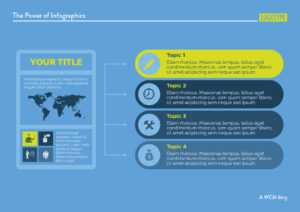
In our mobile world with its fast-moving information, sometimes people can’t be bothered to read an entire paragraph of words. A picture, however, not only grabs their attention, but clearly communicates the message.
That’s why infographics have become more and more prevalent in communicating ideas. A good infographic is eye-catching, conveys the information easily, and makes it memorable and interesting enough for a viewer to share with others via social media. Already, statistics show that images boost social media interaction: A Twitter post with an image doubles the chance of being retweeted or favorited, and even higher among those considered “low authority” (those with fewer followers or who are just getting started on Twitter).
We like infographics as a way to break up long text, reiterate certain points, illustrate dry statistics, or be an attractive alternative to the written information in print and on the web.
So what makes a successful infographic?
1. Keep it short and simple.
Less is more. Clutter it with too much information and too many colors and the message is lost. Simple also means the infographic is transmitting a focused idea or theme.
2. Dig deeper.
Avoid presenting superficial information. An infographic is a good opportunity to dig deeper into some specific data that can be too complex to explain with regular text.
3. Hierarchy of information.
The various ideas and graphics must connect. Like an article, there should be a clear headline, an overarching statement you’re trying to prove, and data to support it.
4. Target your audience.
Select images and icons that your audience can recognize and relate to instantly. The same goes for fonts and size of text. If you’re targeting an older crowd, for example, you’ll want to make sure the text is larger and easy to read.
5. Convey your concept in a single glance.
By simply looking at the headline and images, readers should be able to grasp the overall point right away. The text should be big enough to read at a glance and minimal at best. Too much text and you’ve missed the point of the infographic. Consider dividing the infographic into several if the text is too long and cannot be condensed.
6. People share infographics.
While quantity doesn’t dictate quality, the fact that people are sharing your infographic means it’s caught their attention enough to want to let others know about it. But in order to be shared, you have to kick off the sharing on your end. Post it on your relevant social media channels and target the audience you’re trying to reach.
Pro Tip: If your audience isn’t responding to the infographics, go back, make some tweaks, and test the differences.
With some practice, you’ll discover what styles resonate best with your audiences and what messages are being conveyed better than others. Soon infographics will become a core part of your content plan.
Here are some of WCM’s infographics for clients.


